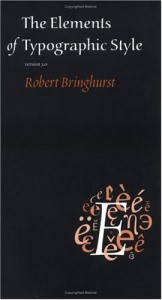
Title: The Elements of Typographic Style
Author: Robert Bringhurst
The story: Following the model set by Strunk and White in their Elements of Style, Bringhurst presents a series of dos and don'ts of typography, covering font selection, page layout, use of bold and italic fonts, numbering, running headers, and so on. There is an interlude for the history of typography, and the book ends with a selection of fonts of different types that he feels are worth looking at. Also covers Greek and Cyrillic alphabets, but has relatively little to say about fonts which cover, for instance, Chinese characters (no doubt a whole book could be written on that subject).
My take: I will admit that I am less interested in typography than the average owner of this book probably is–I do put a lot of text on the web, and I have some thoughts about that (a quick look at any of my writing [hey, there is a link over there <–] will show you that I use some css properties that many people ignore, increasing my line-height to give my characters a little more room to breathe), I am mostly an Elements junkie. Aside from the copy I was issued in college, I have a more recent edition, an illustrated, hardbound edition, and when I saw this, I was too tempted to pass it up. I read it cover to cover, and much of it was interesting.
Last thoughts: I was hoping that when I got to the list of noteworthy fonts I would find one that really appealed to me, but really the most attractive one to me, as they were layed out, was Futura, and I already knew I liked that one. I'm not sure what that says about me.

